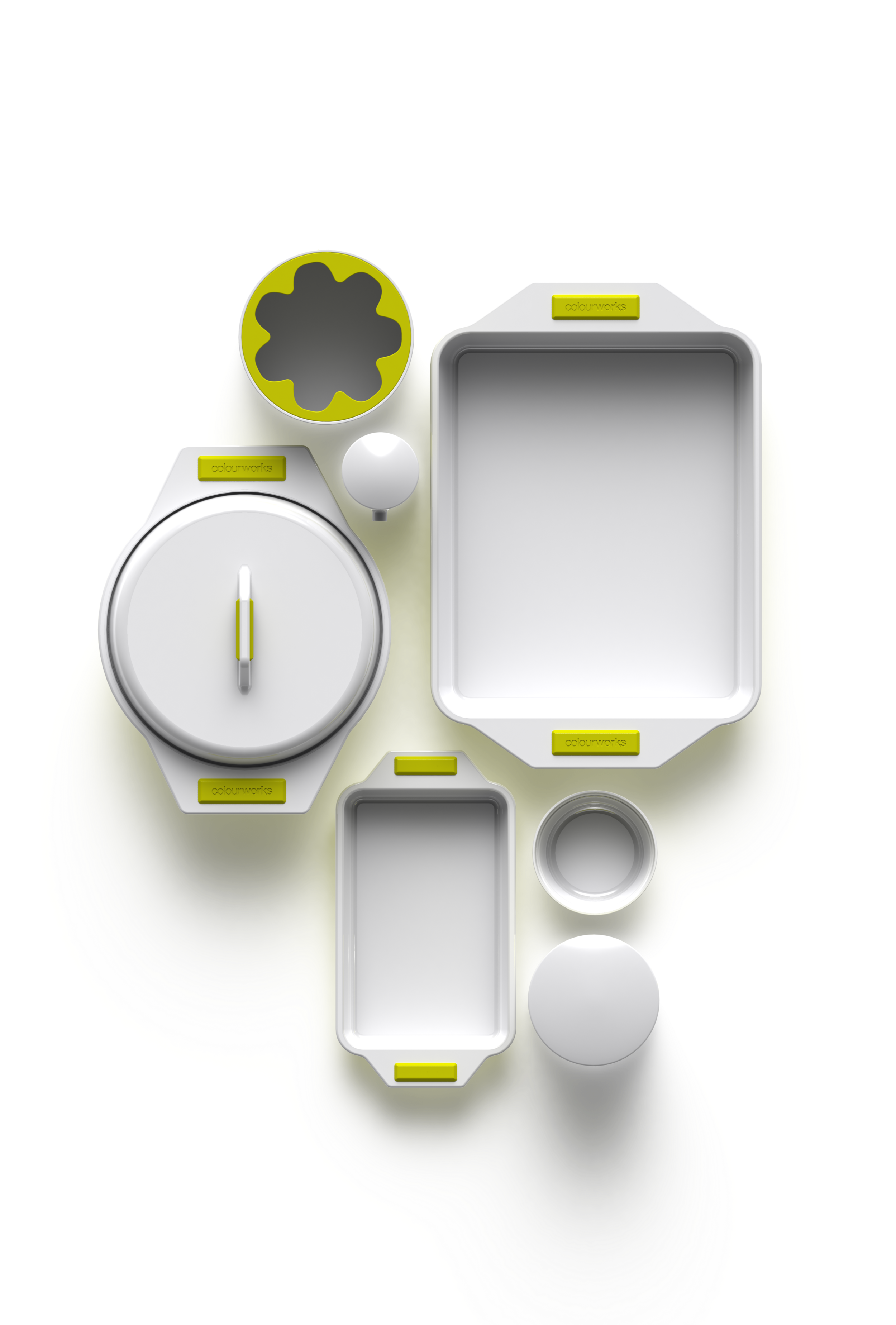
In my first week at Kitchen Craft I was asked to design some colourful and contemporary oven and tableware that was to makeup the first ceramic additions to the companies successful Colourworks range.
Colourworks is one of Kitchencraft's core ranges, and has been a top earner for the company since it was first released in 2009. The range is designed around seven vivid pantone colours, and is notable for it's heavy use of silicone which reproduces the vibrant colours to brilliant effect.
As the Colourworks range is especially expansive, (owing to the number of colours that each product is repeated in) the project required that the number of SKUs be kept to a minimum.
Only the four most popular colours that would also compliment each other were selected, of the (then) six colours in the range. But to reduce the number of lines further, the silicone that was to be incorporated was assigned a novel function. By cutting a window in the silicone band, we could use it as a selector to indicate function of, or the contents of, each product.
Since the application of a graphic displaying one letter was the same cost as applying a decal that wrapped the whole circumference of each item, we were able to apply the letters that stood for "Tea", "Coffee, "Sugar", and "Oil", "Vinegar" in the language of each of our four biggest markets on one SKU per colour variation. The user would simply have to move the silicone band round to show which content they would like to indicate.
The products were a success after their launch at Exclusively Housewares 2012 and featured on the cover of Housewares Live magazine for that spring.


